We thought we'd share some information on our testing process.
My name is David Blooman, I am the principal tester for responsive news, all questions and queries can be sent to me at @dblooman
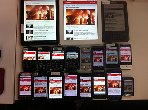
When testing the devices, there are 4 main areas to cover, feature phones, smart phones with low level support, smart phones and tablets. The primary tablet market will be 7-inch devices up to 720x1280 pixels with the lowest smart phone being 240x360 pixels.
Currently, we are only approaching devices that are not conforming to desktops, so smart TV's, games consoles and other exotic devices are test, desktops are not.
We do test desktop browsers, Chrome, Firefox, IE, however we typical test the version which our stats point to, or when there was a feature update. As some browsers use auto updating services, it can often be a case of waiting for the next release to switch testing to a new version.
When testing on a desktop, the hardware does play an important part. The pixel density of large desktop screens, which is typically low, means testing on a desktop screen may prove fruitless, given that any CSS issues may be masked. When testing for mobile, images may also appear over blown or scaled incorrectly, given the larger screen.
The final part of our per-requisite list is cutting the mustard - blog post
Minimum Device Testing
----------------------
- Symbian S60 - N96 (Symbian 9.3)
This phone represents the lowest of our requirements, mobile barlesque, our header, is 240px wide, meaning that our lowest support width is the same. The Nokia N96 is a great test case to identify the impacts to other dependencies within a webpage. This phone is also widely used, given the low cost nature of the OS(open source Symbian), as well as having a strong user base in our stats. The OS also supports opera mini/mobile for comparing a non JS/JS experience - Android 2.2 Native Browser- Galaxy S
This phone is our minimum Android OS support for smart phones, this is based upon the fact that it cuts the mustard in our tests. While the user base for this OS is dropping due to more recent versions of Android, 4.0 etc. This devices is a good hardware point to test against as well. It features a 1ghz CPU, which was less optimised when 2.2 was launched, meaning that 2.2 on a slower CPU may produce a smoother experience. With manual testing, we have discovered a consistency across Android in that, if it works on 2.2, it has a strong chance of working on later versions. Android 2.2 is the best browser to test against for maximum stability across the Android user base, from 2.1 to 2.3.3 - iOS 6 Native Browser - iPhone4S
This browser has taken most of the iOS user base, being stable and having a lot of the more advanced features of HTML5. The browser produces a huge amount of web traffic globally, so testing this is a must for any large commercial website. - Blackberry OS 6 - Bold 9700
BBOS6 is not the latest version of the OS, but does feature a near identical browser as 7, with minor improvements seen in 7. Even so, the uptake of 7 is light, so the focus should be on 6. This is for 2 reasons, 1, BBOS6 supports a Webkit browser, 2, the browser cuts the mustard. What is important to note about BBO6 is the Curve range. The curve range is a budget range of phones with lower report rates or resolutions. The 9300 for example, has a strong user base, but it also is a good indicator of how the smartphone experience is impacted by a screen with a small vertical height. For this reason, testing on a 9300 could give you a skewed result, the same for only testing on the 9700. If you are only testing features that have no layouts and CSS changes, the 9700 is the better of the two, but testing on the 9300 will give you an idea of the budget uses experience. - Nexus 7
Android 4.1 was launched on the most popular Android tablet, the Nexus 7. With 4.1 came Chrome for Android by default, this represents a shift away from the native browser, which many Android OEMs customise. By having a consistent browser across all devices, Google makes testing Chrome easier too. More than that, the Nexus 7 size, resolution and pixel density make it a solid device to test tablet and phone layouts.
Review
----------------------
The list above may be different to the list many others have come up with, this is because many testers will focus on existing markets and user base, which is Android and iOS oriented at the moment. This type of focus is inadvisable given the ease of switching services from apps to web, other competitors to yours. This under estimation of the market and how quickly it can change may lead you to not fully support a browser or entire range of devices. In many test devices list, you will see Android 2.1,2.2,2.3 and 4 devices listed as more priority over Symbian devices. The project will then focus on using emulators with opera installed for Symbian testing, which may provide such a different result, that it could lose market share in Africa, for example. The devices above will cover different break points for design, but also play a secondary part, third party browser testing. Opera is the most popular mobile browser, which is supported on iOS, Android and Symbian, it brings HTML5 support to even the N95. For this reason, Opera should be looked at closely on these devices if you looking into lots of different markets and countries. Opera Mini also plays a big part, the news website is reduced to feature phone look as Opera Mini uses proxy servers, disabling most of the Javascript on the page. A Galaxy Nexus with a 720p screen can make some websites look terrible when using Opera Mini, ensuring you have Opera on you test list is key to success.
Hardware Tests
----------------------
- Device of 240 pixels wide screen - N95
- Device of more than 1000 wide screen - Any device
- Touch Screen - Any device will be relevant, this is to test hit states, button placements and general usage while using a device with on screen keyboard.
- Non-touch - In most cases, Symbian and blackberry phones will fall into this category, how the user can navigate the site is of importance, so testing the functionality of the site with such devices is a high priority.
These 4 additional requirements may require additional devices, but in investing in this equipment, the devices will cover most of the core stats and you will be able to test against the majority of browsers and input methods. This should allow you to see where your problem areas are going to be, as you can quickly identify which browsers have the key levels of JavaScript and technologies support required.
It is recommended that you clear all cookies, cache and reset browser to default before beginning any testing. Not doing this can lead to older versions of the site interfering with testing as you always must look at the latest version of the site. With builds occurring all the time, minor changes will often show little impact, such as back end work. Front end work can mean changes to the site that will fundamentally affect testing, as the look can be radically different on certain devices. You should always consider this when working, there is no such thing as a minor change when testing responsive web pages.
Further Testing
---------------
For further testing, the following list identifies the most common Mobile OS's. Below is explanation of the differences between the OS's and browsers, this could help you determine whether you testing need to extend to all the devices.
The Android 2.3 OS has the the largest user base of Android, therefor the most users on that versions browser. We use the Galaxy S as 1, it is one of the most popular devices in our stats, 2, it has a typical size screen and pixel density for that OS, meaning a more balanced approach when doing UI testing.
The Bold 9700 is again, one of the more popular devices, but it also represents a crossover device from OS5 to OS6. It's screen is of a good pixel size for Blackberrys and its internals are one of the more high specifications for a feature phone.
Windows phone is a good way of testing IE10, as a large amount of the code base was used to create the browser on WP8, though mobile has less features.
- iOS 6 - iphone 4
- Android 2.2 - HTC desire
- Android 2.3 - Samsung Galaxy S
- Android 4 - Both stock and Chrome browsers
- Blackberry OS 5 - Bold 9700
- Blackberry OS 6 - Bold 9700
- Blackberry OS 7 - 9380
- Windows Phone 8 - Lumia 920
- Symbian S60 - Symbian Browser
- Symbian S40 - Nokia Browser
- Nexus 7
- iOS 6 - iPad
Browser and OS Analysis
-----------------------
While emulators are very useful in a lab style environment, they often miss things that are only found when using handsets. There is also a lot of nuances that you will discover when you use this many devices. Below is a combination of personal experience, information from other sources and my opinion on the direction when testing responsive design.
iOS. The iphone and ipod range from the 3Gs upwards all support iOS5, which has support for most standards, the browser on iOS5 is the same on every device, therefore testing on 1 device is suitable. The second most supported version of the OS which supports a slightly lower performing browser is iOS4, however this has not performed differently except in hardware (larger screen) Here is a comparison of the 2 versions http://www.blaze.io/mobile/ios5-top10-performance-changes/ - The range of iOS devices represents nearly 20 million page views per month, hence it's high priority status.
Android 2.1 is the lowest version of Android to cut the mustard. Android has varying levels of support, Android 2.2 browser and onwards has been the most consistent, with Android 2.2 and 2.3 being the highest user base. Android 2.1 has the ability to support many smart phone features, but lacks some font embedding and other technologies, such as Flash. This has proven to be one of the more problematic devices, but is considered a baseline phone for smart phone support. This particular version of Android is in decline as the jump from 2.1 to 2.2 is being made, or the user upgrades to a different phone. Android 2.1 represents about 25% of the Android user base with a million page views per month.
Android 2.2 was the last version to be open source, so a lot of devices used this version for Google TVs, phones, music players etc. The browser for 2.3 is also based on this version. Differences in the operating system can have some impact on the browser, but the difference between 2.2 and 2.3 is mostly down to how the particular vendor changes the phone. A change log is listed in the link below http://www.knowitsdifference.com/difference-between-android-2-2-and-android-2-3/ Android 2.2 is a measurable jump in performance over 2.1, the user base is almost 3 times as big with nearly 8 million page views per month. Android 2.3 offers an overall system update that is relevant to user, not as much for browsers though. In our test, there have been less that 1% of difference between the 2, with only 1 or 2 bugs discovered not to replicate on both versions. The 7 million combined users with 20 million page views shows us how important it is to correctly test on Android 2.x versions.
What is important to note about 2.2 is the browser features a shrunk down version of desktop Chrome's V8 JavaScript engine, Google have integrated it into the Android 2.3 OS to drastically improve JS performance. When testing Android 2.1 and 2.2, the should be treated as different entities, rather than just a point release, such as 2.2 and 2.3.
Android 3 is the tablet skew of the OS. 3.2 and above supports lower screen sizes that mean you can have a large range of devices, so testing on this version is best. The update of Android tablets is still very small compared to iOS devices, like the iPad, however the browser is very high quality. The Android 3 OS is essentially a fork of Android 2.2, as such is inherits much of the browser from there. However there is added support for multi touch within Javascript and improved zooming options.
Android 4 is the newest and most advanced version of the OS, it currently supports 2 browsers, Chrome and the Android browser. It seems that Google intend to replace the stock browser with Chrome on upcoming devices, so testing on both until this is that case is prudent. The current version of Chrome uses a new version of Webkit than the stock android browser. Info on browser http://www.android.com/about/ice-cream-sandwich/. What it is important is the that Chrome is a Google product, therefore it may not be present on the open source version of the OS, so for future testing, stats will determine which webkit version and by extension, which browser is the most popular on the platform. Android 4.1 brought a few improvements over 4.0, better HTML5 video support, supports the updated HTML5 Media Capture specification on input elements.WebView now supports vertical text, including Ruby Text and other vertical text glyphs.
Android 4.1 had a few tweaks to the browser, but in reality, the focus is now on Chrome as the stock browser faces heavier competition. Chrome Should be seen as an equal in testing to the stock browser.
Blackberry OS 5 is a pure feature phone experience, it's screen size support is one of the biggest factors, given the high landscape resolution, but low vertical. The browser has been the most consistent for feature phones, supporting all the requirements.
Blackberry OS 6 has patchy support, it uses a webkit browser, but the support for font embedding has been hit and miss. The browser is currently one of the highest usage of the website, meaning that this is important OS for testing. Newer versions of the Blackberry browser seem to have fixed the issues we are having with 6. Browser Info http://crackberry.com/blackberry-6-review - new-browserhttp://crackberry.com/blackberry-6-review#new-browser One of the core issues with Blackberries is the fact that they have unusual screens. The majority of phones sold between 2008 and 2011 have a 480x360 screen; this is intended for reading emails instead of web pages. What should also be tested is what the screen reports itself as, on some devices the resolution is dropped to 360 wide due to hardware limitations. It is important to identify issues with the look and feel on a webpage based upon these types of devices, especially for us with more than 4 million users and 16 million page views.
Blackberry OS 7 has improvements over the BBOS6 browser. Most of the bugs have been fixed, while adding new features such as a web inspector and better video/audio support. The full list can be found here, but the highlights include support for native touch and cursor events, web socket API support and new media support in the form of <audio> and <video> elements, as well as the <source> element which lets you specify a media resource. There is also a new JIT (Just-In-Time) JavaScript® compiler that offers better performance.
Windows Phone 7 uses the same code base as Internet Explorer 9, in a lot of cases, phone issues replicate onto the desktop. If there are issues on the mobile OS, testing on IE9 could be the fastest way to identify the issue, the mobile version is essentially a stripped down version of the desktop browser, as such, don't expect high levels of support for technologies. The lack of font embedding is of a particular annoyance, for this reason, IE9 and WP7 fall into smartphone with low level support category. http://en.wikipedia.org/wiki/Windows_Phone_7.5 Windows Phone 8 will launch with a new, IE10 based browser with much better HTML5 support, at time of writing, it still is being developed. Windows phone 7 is now a deprecated platform, with not more updates coming, as usage goes down, so will the need to support this browser.
Windows Phone 8 has an IE10 based browser with much better HTML5 support, at time of writing, it still has some issues. IE 10 has a large bug with viewport tags, this leads to hardware pixels being detected rather than software. There is a fix in the works from Microsoft, no timeline on that though. IE 10 offers a much better support listed here, some of the things IE10 mobile can't support are Inline video, Some new manipulation views APIs for touch panning and zooming, with the exception of –ms-touch-action, Multi-track HTML5 audio (simultaneous), ActiveX and VBScript, Drag-and-drop APIs, File access APIs with the exception of blobs which are supported on Windows Phone 8.
Symbian phones are a large combination of S60, S40 and Symbian Belle, there is massive variations in the devices as there are hardware and software limitations of the range. In most cases, the S40 phones are feature phones. Some phones are being logged with a new webkit browser; this browser can do some JavaScript, however the usage figures are low as it requires a manual update. The S60 phones are also mostly features phones, though Nokia is updating many phones with a newer browser that supports up to HTML 5.0 and JavaScript 1.8, most of these phones will receive the feature phone version of the site, however these are low usage devices. In stats, these phones can appear as either S60 or S9.x, the latest version of the S9.x is 9.5. Finally there is a new version of Symbian, sometimes seen as Nokia OS or Symbian Belle, this version is also a hit and miss support OS. While this version is low usage, it could become more common in emerging countries. Given that Nokia doesn't use Over The Air (OTA) updates for its phones, users of the Nokia N8, the latest Symbian phone, could be running any one of 3 different versions of Symbian, each with its own version of the webkit browser, only the latest version supports HTML 5. Some phones will also come with some version coming with Opera, netfront and webkit depending on location, so Symbian testing is very limiting when trying to ensure maximum support. In our testing, we should focus on the Nokia N95 and Nokia N8, these feature different versions of S60 and have different browser versions, so provide a solid range of old browsers in Africa, with modern the UK. The most recent UK launch of a Nokia Symbian phone is the N8, which currently is classed as a feature phone, even though it support is relatively good, it does not cut the mustard. The best browser for this type of Symbian phone is Opera mobile, fast and fully feature, we do a lot more testing of Opera on Symbian S60 with Opera than any other platform. Link to different Symbian versions: http://en.wikipedia.org/wiki/Web_Browser_for_S60
Symbian 10 is also known as Symbian Belle, a new brand from Nokia. This comes with a brand new browser which is Webkit based and supports lots of good HTML5 features. There a few notable issues, such as font embed support, but it brings a few Nokia/Symbian phones into the realm of HTML5, which is a good thing. Check out my post here for more info
Silk Browser. Amazon has forked Android 2.2 to create the Kindle OS with Silk browser. This browser routes all traffic through Amazon servers and can affect some elements of the website. Form submission is something that should be thoroughly tested to ensure the server is able to receive the form data. You may also find that because of the form factor, you will have to make a decision, only use smartphone layouts or use both tablet and smartphone layouts, this is mostly due to the screen width being able to support tablet web pages. But what is most troubling for the tester is that you may have to test both of these layouts on the say device, this is going to really annoy you.
Silk Browser version 2 is a fork of 4.0 with the AOSP browser. This browser has had some changes for the cloud sync, but has the same support as Android 4 stock browser.
The iPad is currently the market leader, with the single device having 60% of the market, the market grows every month though, so the user base is ever growing. While the differences to the iPad browser are subtle to the iPhone browser, it is important to look at the iPad as the biggest device, in terms of screen size, that users will visit with. While this device can support most, if not all, desktop sites with ease, it is important to remember that speed and simplicity are often desired more than functionality. For this reason, users of iPads and other tablets, will use the mobile version of the site, especially if they are using a data service. If it is outside of the scope of your project, you should consider potential markets with the iPad, responsive news' largest device support is 7 inches, however testing is conducted on the iPad.
Browsers
-----------------------
The next section will include information about the browsers that you will need to test in addition to the native browsers we have already talked about. Just to reiterate, all the operating systems we have talked about so far have their own native browser.
Third party browsers that have big impact in the world include:
UC Browser - Information
Chrome Mobile - Information
Opera Mini/Mobile - Information
Firefox - Information
As we are test for users all over the world, UC browser and Opera Mini may be less important to you. These 2 browsers combined represent a sizeable chunk of Africa and Asia browsing traffic, so if you are in that region, you are probably already testing on it. Firefox is growing, but they are updating rapidly, so testing on the latest stable build is advisable, especially as it is more than likely the user will upgrade. The complete custom build is only available on Android. Chrome is not yet the default browser, it will also sit alongside the native Android browser, at least for now. Testing on both is probably the best approach, similar to Firefox, testing the latest build is best. There is a version of Chrome for iOS, but this uses the same version of Webkit as the version of IOS you are on. The Android version of Chrome is update frequently and is the only place to get the complete Chrome build.
Summary
-----------------------
In total, you final device list could have other smaller markets included, our current device list looks something like this :
- iOS 6 - iPhone
- iOS 6 - iPad mini
- iOS 6 - iPad
- iOS 5 - iPad
- iOS 5 - iPod
- Android 2.1 - HTC desire
- Android 2.2 - Samsung Galaxy S
- Android 2.3 - Samsung Galaxy S
- Android 3.2 - Motorola Xoom
- Android 4.0 - Galaxy Nexus (Stock and Chrome)
- Android 4.1 - Galaxy Nexus (Stock and Chrome)
- Blackberry OS 4 - Curve 8520 (We have recently dropped testing this browser)
- Blackberry OS 5 - Bold 9700
- Blackberry OS 6 - Bold 9700
- Blackberry OS 7 - Bold 9860
- Windows Phone 7.5 - Lumia 800
- Windows Phone 8 - Lumia 920
- Symbian S60 - N95
- Symbain S60 - N8
- Symbian S40 - C3
- Symbian S40 - Asha 303
- Kindle E-Reader
- Kindle Fire - Android 2.2 Fork
- Kindle Fire HD - Android 4 Fork
- Android 3.0 - Samsung 7.7
- Android 4 - Samsung 7.0 v2
- Android 4.2 - Nexus 7
- IE 10 - Microsoft Surface
Edit 20/6/2012 - We have recently determined our 3 in market tablets to look at, Kindle fire, BB Playbook and Galaxy Tab 7.7. They are all webkit based browsers, but have some differences in support, as well as volume of sales. The 7.7 uses a pixel ratio of 1, whereas the other 2 dont, this means that the break points will have to be correctly established for tablets in order for users not to receive broken features.
Edit 29/8/2012 - We are no longer testing on BBOS4 anymore, we have found the share to drop below our support level and global usage has dropped to an all time low. We have added other versions of Android and other hardware sets, such as 7 inch tablets.
Edit 13/9/2012 - I have made some big changes to the testing list this month, we have changed the minimum level of support to start at Android 2.2 and BBOS6, this is due to total browser market shifts on the site as well as globally and within the UK.
Edit 13/11/2012 - I have now updated list to include changes to BBOS7, IE 10 on Windows and some Android and iOS support changes.
Edit 16/01/2013 - I have updated Windows phone to indicate our new support list, as well as changing our testing devices